Ekhtiar Now
Perso-Arabic Display Type Family
An important element that helps a calligrapher or typeface designer analyze the calligraphic models in Arabic script is the ratio of "straightness" (سطح) to "roundness" (دور) in the letters.
According to the description of "the twelve fold calligraphic principles" (قواعد دوازدهگانهٔ خوشنویسی), roundness is defined as circular pen movements, as seen in the letter noon (ن), and straightness is defined as horizontal, vertical, and oblique pen movements in strokes within letters, as seen in the letter kaf (ک).
The geometry of the Nasḫ script is simpler than the other scripts developed after it, such as Reqāʿ, Taʿlīq, and Nastaʿlīq, since it has more straight pen movements compared to more rounded movements in those other scripts.
Thus, Nasḫ script is typically used as a model for the design of the letters in Arabic typefaces, whereas other calligraphic models with more circular and roundish forms are less noticeable by Arabic typeface designers due to their form complexities.
The shapes of the letters in scripts like Taʿlīq and Nastaʿlīq, as well as their cursive counterparts, are organic. Because of this, instructors in the calligraphy schools of these scripts sometimes liken some letters to animal forms to help the learners. This characteristic makes it difficult to convert these calligraphic scripts into typeface designs. Since discovering the hidden geometry of the letters and, as a result, creating an efficient typographic representation necessitates a thorough understanding of the script.
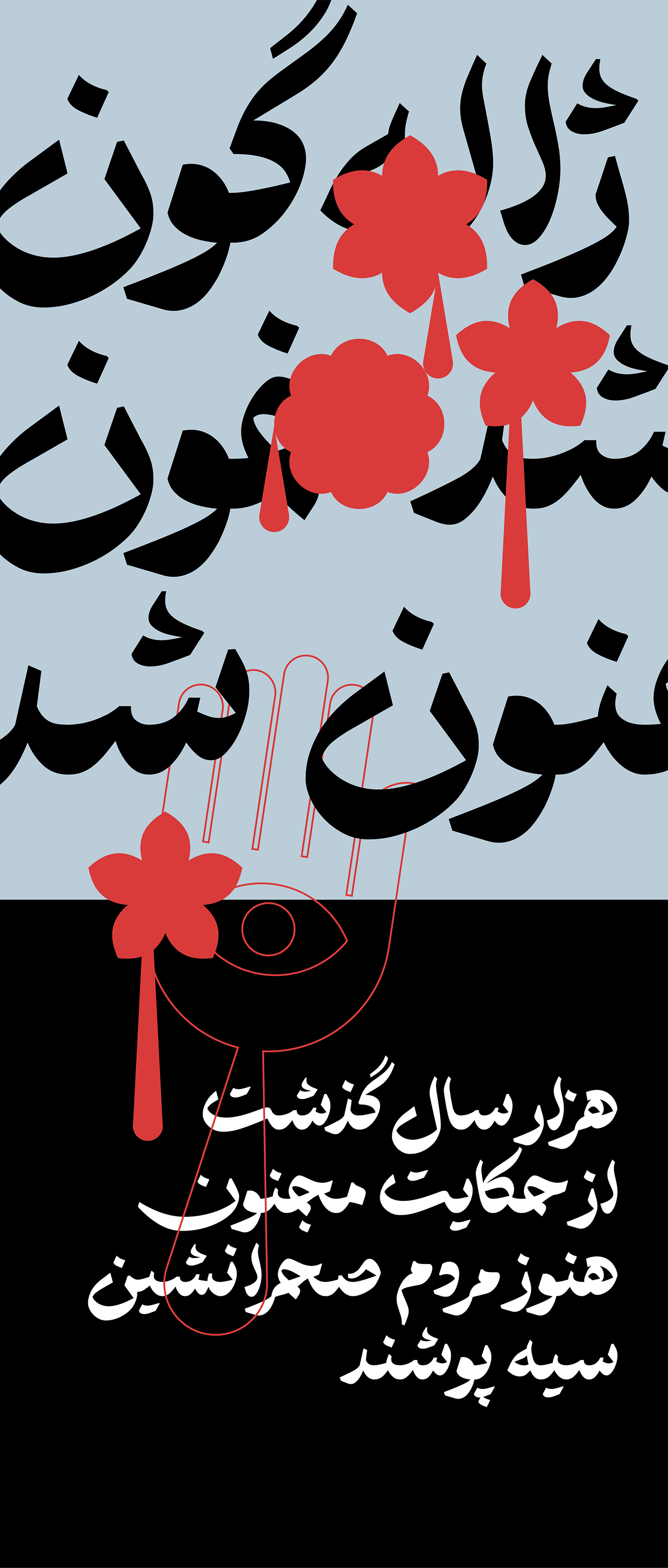
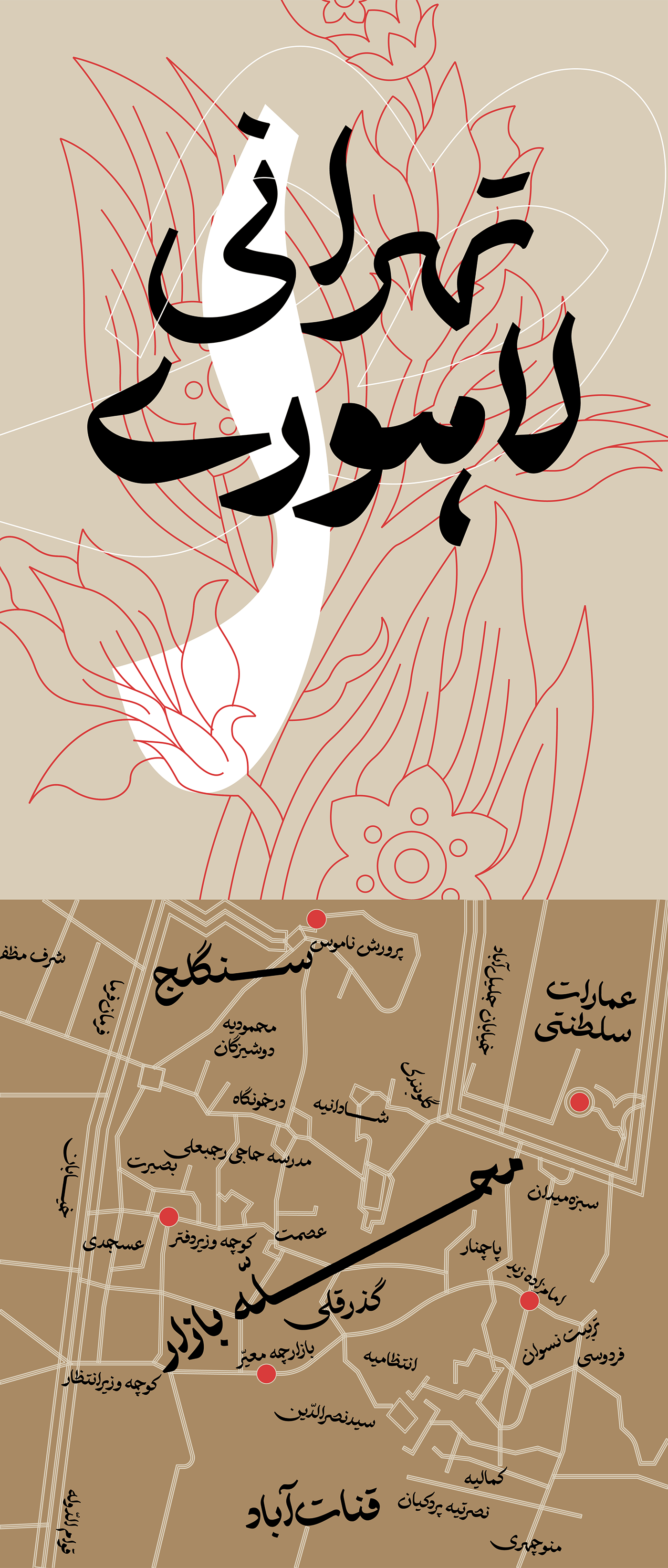
The "Ekhtiar Now" type family is an attempt to translate Taʿlīq script into typeface design language; Furthermore, the design of Ekhtiar Now was inspired by scripts such as Dīvānī and Nasḫ.
Ekhtiar Now is more versatile than Ekhtiar and can be used for common tasks such as running large text or titles. In Qalam-Bartar, a font engineering improvement was implemented to ensure proper typesetting without user modifications and to prevent dot collisions and inharmonious typesettings.
Ekhtiar Now has been designed in five different styles and weights: Khafi, Kitab, Jadoo, Mashq, and Jali. Weight names are conceptual and do not always correspond to their calligraphic definitions:
Ekhtiar Now—Khafi: It has light and low-contrast letterforms that are suitable for display and for being used as a secondary style, such as oblique.
Ekhtiar Now—Kitab: It has a "regular" thickness, making it suitable for being used as a text typeface.
Ekhtiar Now—Jadoo: Jadoo's thickness falls between "regular" and "bold," making it ideal for running subtitles or paragraph headings. The jadoo pen is typically used in Persian calligraphy for writing headlines and has a nib width of 3–4 millimeters.
Ekhtiar Now—Mashq: A bold typeface designed for titling and display purposes.
Ekhtiar Now—Jali: The thickest and most expressive weight of Ekhtiar Now is perfect for setting large-scale texts and short titles.
Ekhtiar Now is intended to be a new tool for Arabic script users as well as to motivate Arabic typeface designers to regard other calligraphic models of this script.